While testing the web or desktop (windows form) application, it is very important to consider given below testing types and checklist mentioned in each testing type. This checklist is almost applicable for all types of web and desktop applications depending on the business/client requirements.
While testing the web or desktop (windows form) application, it is very important to consider given below testing types and checklist mentioned in each testing type. This checklist is almost applicable for all types of web and desktop applications depending on the business/client requirements.
The web/desktop application testing types and checklist consists of:
- Usability Testing
- Functional Testing
- Compatibility Testing
- Database Testing
- Security Testing
- Performance Testing
Now let’s look at each testing type’s checklist in detail:
Usability Testing
What is Usability Testing?
- Usability testing is nothing but the User-friendliness check. In simple words, how easy a lay-man can use and understand the functionality of the website.
- In Usability testing, the application flow is tested so that a new user can understand the application easily.
What is the purpose or Goal of Usability testing?
A Usability test establishes the ease of use and effectiveness of a product (web or desktop application) using a standard Usability test practices.
What should be tested in Usability testing?
- Web page content should be correct without any spelling or grammatical errors.

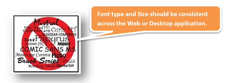
All fonts should be the same as per the requirements.
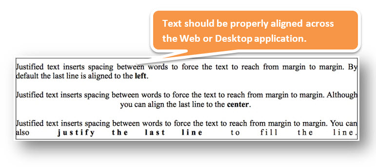
All the text should be properly aligned.
All the error messages should be correct without any spelling or grammatical errors and the error message should match with the field label.

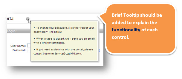
Tooltip text should be there for every field. (Best Practice)
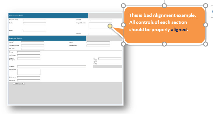
All the fields or controls (e.g. Text boxes, radio buttons, checkboxes, etc.) should be properly aligned.
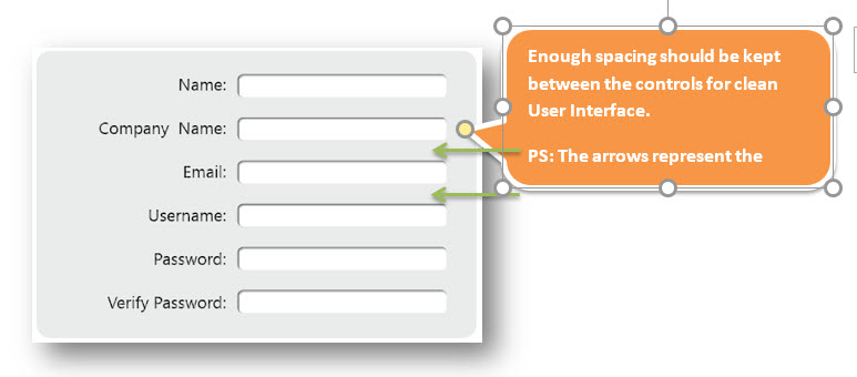
Enough space should be provided between field labels, columns, rows, and error messages.
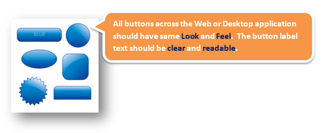
All the buttons should be in a standard format and size.
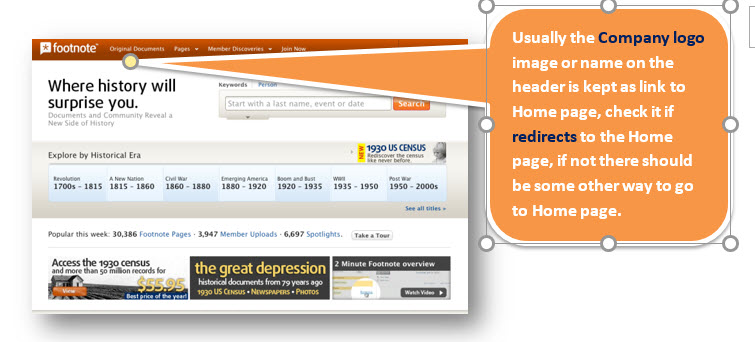
The home link should be there on every single page.
Disabled fields should be grayed out.

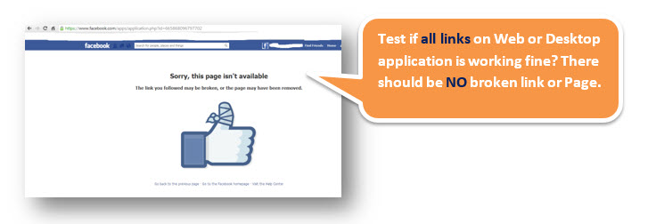
Check for broken links and images.
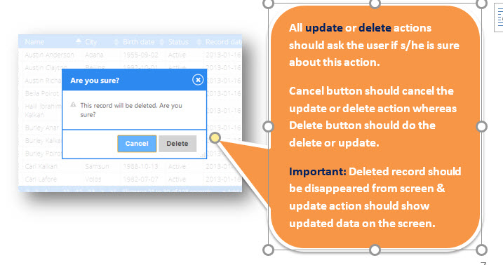
A confirmation message should be displayed for any kind of update and delete operation.
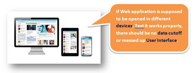
Check the website for different resolutions (640 x 480, 600×800, etc.?) and on mobile or tablet when required.
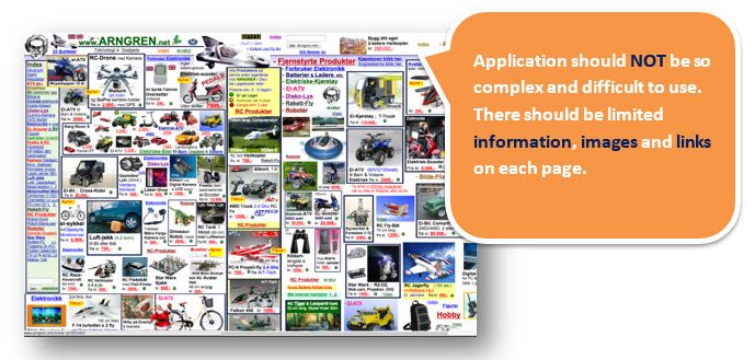
Check the end-user can run the system without frustration or a lot of training.
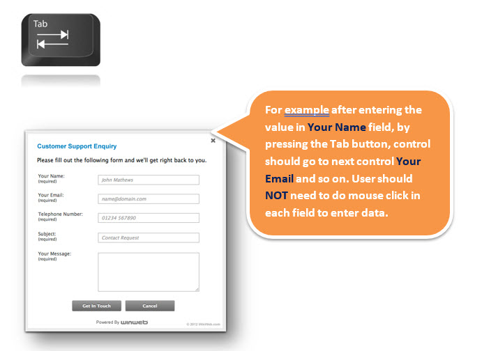
Check the tab should work properly to jump from one controller to another.
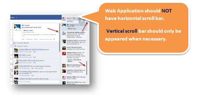
The scrollbar should appear only if required.
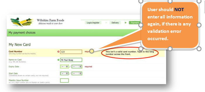
If there is an error message on submit, the information filled by the user should be there.
The title should display on each web page.

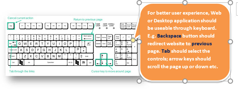
All fields (Textbox, dropdown, radio button, etc.) and buttons should be accessible by keyboard shortcuts and the user should be able to perform all operations by using the keyboard.
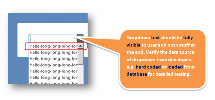
Check if the drop-down data is not truncated due to the field size and also check whether the data is hardcoded or managed via administrator.
