


In the last eight parts, we pretty much completed the server-side code to create the User APIs. In this part, let start implementing the front-end application in Angular 10.
Let’s Start
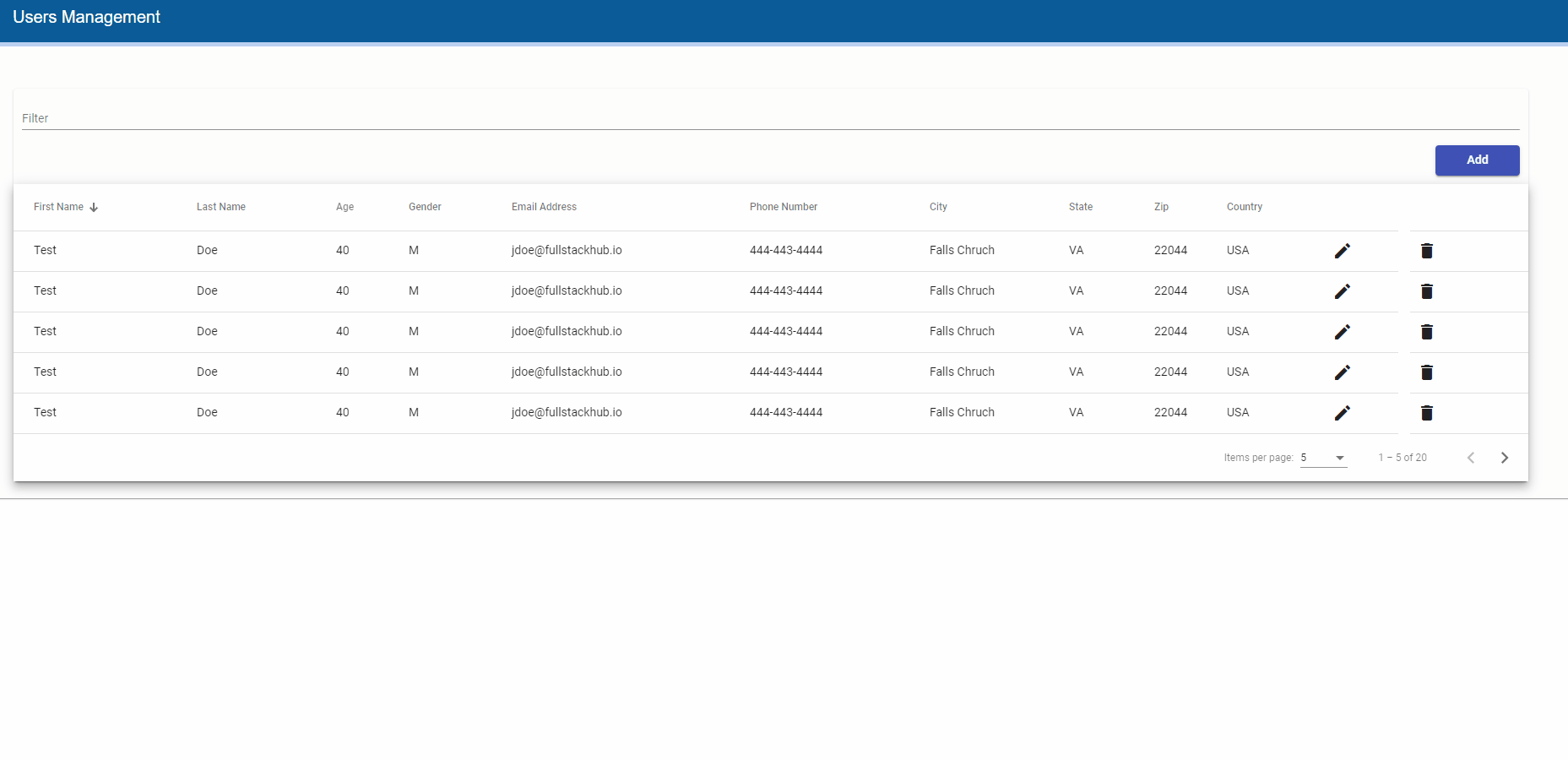
In the first part, we deleted the entire ClientApp folder content that was the default Angular 8 project and created the Angular 10 project. Let’s go ahead and create the User Management front-end application, the end front-end screens would look like the following:
Create Angular Application Basic Architecture
Before developing the User Management components, let install the required packages, and create the shared components that would be used by all components. Right now, let’s focus on basic Angular applications with no authentication or exception handling, etc. In the future, I may add those functionalities along with unit and integration tests. To open the ClientApp folder in VS Code. I usually right-click on the ClientApp folder in Visual Studio, select Open in Terminal and in Developer PowerShell, type code . opens the folder in VS Code.
user-management-api.ts Auto-generated File
As discussed in previous parts, the swagger generates the Angular HTTP client for all User APIs and also import DTOs, VMs, and Entities as classes and interfaces in UserService class. Just go through this file, you would see the get, getAll, post, put, delete functions, UserVM, UserDTO classes, and interfaces with the same properties but in the camel case means they start from lowercase character. Remember, we explicitly specify this configuration in the nswag.json file. So be careful when binding these model classes to HTML elements because Typescript is case-sensitive. As stated earlier, DO NOT edit/update this file since it re-generates each time we build a solution. We will see, how easy it is to use UserService in User components to load, add, update, and delete the users.
Install Angular Material
Though there are a couple of good Angular UI component libraries available I prefer Angular Material UI components since they are easy, well documented, and managed by the Angular team. This is my personal choice, feel free to use any library you want to use. I am using Bootstrap just for the Grid system since I am not an expert in the Angular Material Grid list.
Open the command prompt in VS Code by selecting View -> Terminal, run the following command follow the wizard (if for any reason, you are getting error in Powershell, try to run it in CMD window):
ng add @angular/materialSince we are going to use a couple of Angular Material UI components, let’s add a separate file for the material module and add its reference to AppModule. In the src -> app folder, create a new file material-module.ts and add the following code to it:
import {NgModule} from '@angular/core';
import {A11yModule} from '@angular/cdk/a11y';
import {DragDropModule} from '@angular/cdk/drag-drop';
import {PortalModule} from '@angular/cdk/portal';
import {ScrollingModule} from '@angular/cdk/scrolling';
import {CdkStepperModule} from '@angular/cdk/stepper';
import {CdkTableModule} from '@angular/cdk/table';
import {CdkTreeModule} from '@angular/cdk/tree';
import {MatAutocompleteModule} from '@angular/material/autocomplete';
import {MatBadgeModule} from '@angular/material/badge';
import {MatBottomSheetModule} from '@angular/material/bottom-sheet';
import {MatButtonModule} from '@angular/material/button';
import {MatButtonToggleModule} from '@angular/material/button-toggle';
import {MatCardModule} from '@angular/material/card';
import {MatCheckboxModule} from '@angular/material/checkbox';
import {MatChipsModule} from '@angular/material/chips';
import {MatStepperModule} from '@angular/material/stepper';
import {MatDatepickerModule} from '@angular/material/datepicker';
import {MatDialogModule} from '@angular/material/dialog';
import {MatDividerModule} from '@angular/material/divider';
import {MatExpansionModule} from '@angular/material/expansion';
import {MatGridListModule} from '@angular/material/grid-list';
import {MatIconModule} from '@angular/material/icon';
import {MatInputModule} from '@angular/material/input';
import {MatListModule} from '@angular/material/list';
import {MatMenuModule} from '@angular/material/menu';
import {MatNativeDateModule, MatRippleModule} from '@angular/material/core';
import {MatPaginatorModule} from '@angular/material/paginator';
import {MatProgressBarModule} from '@angular/material/progress-bar';
import {MatProgressSpinnerModule} from '@angular/material/progress-spinner';
import {MatRadioModule} from '@angular/material/radio';
import {MatSelectModule} from '@angular/material/select';
import {MatSidenavModule} from '@angular/material/sidenav';
import {MatSliderModule} from '@angular/material/slider';
import {MatSlideToggleModule} from '@angular/material/slide-toggle';
import {MatSnackBarModule} from '@angular/material/snack-bar';
import {MatSortModule} from '@angular/material/sort';
import {MatTableModule} from '@angular/material/table';
import {MatTabsModule} from '@angular/material/tabs';
import {MatToolbarModule} from '@angular/material/toolbar';
import {MatTooltipModule} from '@angular/material/tooltip';
import {MatTreeModule} from '@angular/material/tree';

@NgModule({
  exports: [
    A11yModule,
    CdkStepperModule,
    CdkTableModule,
    CdkTreeModule,
    DragDropModule,
    MatAutocompleteModule,
    MatBadgeModule,
    MatBottomSheetModule,
    MatButtonModule,
    MatButtonToggleModule,
    MatCardModule,
    MatCheckboxModule,
    MatChipsModule,
    MatStepperModule,
    MatDatepickerModule,
    MatDialogModule,
    MatDividerModule,
    MatExpansionModule,
    MatGridListModule,
    MatIconModule,
    MatInputModule,
    MatListModule,
    MatMenuModule,
    MatNativeDateModule,
    MatPaginatorModule,
    MatProgressBarModule,
    MatProgressSpinnerModule,
    MatRadioModule,
    MatRippleModule,
    MatSelectModule,
    MatSidenavModule,
    MatSliderModule,
    MatSlideToggleModule,
    MatSnackBarModule,
    MatSortModule,
    MatTableModule,
    MatTabsModule,
    MatToolbarModule,
    MatTooltipModule,
    MatTreeModule,
    PortalModule,
    ScrollingModule,
  ]
})
export class MaterialModule {}
You can keep it like it, I trust the Angular tree shaking ability to not include the unused module in the production build. Add its reference in AppModule (app.module.ts) like the following:
import { BrowserModule } from '@angular/platform-browser';
import { NgModule } from '@angular/core';

import { AppRoutingModule } from './app-routing.module';
import { AppComponent } from './app.component';
import { BrowserAnimationsModule } from '@angular/platform-browser/animations';
import { MaterialModule } from './material-module';

@NgModule({
  declarations: [
    AppComponent
  ],
  imports: [
    BrowserModule,
    AppRoutingModule,
    BrowserAnimationsModule,
    MaterialModule
  ],
  providers: [],
  bootstrap: [AppComponent]
})
export class AppModule { }
Create Shared Components
From the above User Management GIF, you probably got an idea of what we are going to develop, in short, the home page would have a data grid with an add button on top, edit and delete buttons next to each user record. The add, update, and delete buttons would open the modal pop-up control and show the Snackbar control at the bottom after the user would perform any operation with a success or error message.
To facilitate the above functionality, let’s create enumeration for database operations to recognize and perform corresponding actions accordingly. In the src -> app folder, create a shared folder, and then create an enum.ts file in it. Add the following code in this file:
export enum DBOperation {
    create,
    update,
    delete
}
Next, let’s create common functions to open the modal pop-up control for add, update, delete user functionality, and show snack bar control when the user would submit these requests and get the responses back. These functions would be encapsulated in a util service. In the shared folder, create a new file util.service.ts and add the following code to it:
import { Injectable } from '@angular/core';
import { MatSnackBar } from "@angular/material/snack-bar";

@Injectable({
  providedIn: 'root'
})

export class UtilService {

  constructor(private _snackBar: MatSnackBar) { }

  openCrudDialog(dialog, component, width) {
      const dialogRef = dialog.open(component, {
          disableClose: true,
          width: width
      });
      return dialogRef;
  }

  openSnackBar(message: string) {
      this._snackBar.open(message, 'Close', {
          duration: 3000,
      });
  }
}
Quite self-explanatory code in UtilService, the openCrudDialog function is taking the MatDialog object reference, component to be opened e.g. add, update or user screen and width of modal pop, opening the dialog and sending the opened dialog reference back to the calling function so that we can perform any function after subscribing to its event(s) e.g. close event to open the snack bar with success or error message and that is where openSnackBar function comes to in a picture that is only taking the message and showing it for three seconds.
That’s it for shared component for now.
Update styles.css
In src folder, replace the styles.css file content with following:
/* You can add global styles to this file, and also import other style files */
@import "~@angular/material/prebuilt-themes/indigo-pink.css";
/* Provide sufficient contrast against white background */

html,
body {
  height: 100%;
  overflow: auto;
}
body {
  margin: 0;
  font-family: Roboto, "Helvetica Neue", sans-serif;
}

.container {
  width: 100% !important;
}

/*Custom*/

.section-padding {
  padding-top: 25px;
}

mat-card {
  margin: 0px !important;
  padding: 0px !important;
  background: rgb(253, 253, 253) !important;
}

mat-card-noshadow {
  background: #ececf4;
  box-shadow: none !important;
}

mat-card-header {
  background: #0a5b97;
  border-bottom: 5px solid #bbd1f1;
  height: 50px;
  padding-left: 5px;
}

mat-card-title {
  vertical-align: baseline;
  padding-top: 10px;
  padding-bottom: 0px;
  padding-left: 10px;
  font-size: 14pt;
  font-family: Arial, Helvetica, sans-serif;
  color: #ffffff;
}

mat-card-content {
  padding: 10px;
  padding-left: 17px;
  padding-bottom: 5px;
  color: #000 !important;
}

.mat-card-popup-width {
  width: 95vw !important;
}

mat-grid-tile {
  padding-bottom: 20px !important;
}

mat-grid-tile .mat-figure {
  align-items: flex-start !important;
  height: 100% !important;
}

.mat-dialog-container {
  padding: 0 !important;
  margin: 0 !important;
  overflow: visible !important;
}

mat-form-field {
  width: 100%;
}

.dialog-footer {
  padding-top: 10px;
  text-align: right;
  padding-bottom: 10px;
}

.footer
{
    padding-top: 20px;
    padding-bottom: 10px;
    text-align: right;
}

.progress-loader
{
  position: fixed;
  top: 50%;
  left: 50%;
  z-index: 999999999;
}

.overlay{
   height:100vh;
   width:100%;
  background-color:rgba(207, 203, 203, 0.286);
  z-index:    9999999;
  top:        0;
  left:       0;
  position:   fixed;
}
/*Custom*/

/******************Form**************************/

.frm-ctrl {
  width: 100%;
  padding-bottom: 15px;
}

/******************End Form**************************/


/******************Button**************************/

button {
  width: 100px;
  outline: none !important;
}

.button-lg {
  width: 165px;
}

.button-ex-lg {
  width: 300px;
}

/******************End Button**************************/

/******************Padding**************************/

.padding-15 {
  padding: 15px;
}

.padding-10 {
  padding: 10px;
}

.padding-left-10
{
 padding-left: 10px;
}

.padding-bottom-15
{
  padding-bottom: 15px;
}

.padding-bottom-10
{
  padding-bottom: 10px;
}

.padding-top-5
{
  padding-top: 5px;
}

.padding-top-15
{
  padding-top: 15px;
}

/******************End Padding*************************/

/******************File Upload**************************/
input[type=file] {
  cursor: pointer;
  width: 180px;
  height: 34px;
  overflow: hidden;
}

input[type=file]:before {
  width: 180px;
  height: 35px;
  line-height: 32px;
  content: 'Select File to Upload';
  display: inline-block;
  background: #3F51B5;
  border: 1px solid rgb(53, 69, 160);
  padding: 0 10px;
  text-align: center;
  color:#fff;
  border-radius: 2px;
  font-size: 11pt;
}

input[type=file]::-webkit-file-upload-button {
  visibility: hidden;
}

.upload-file-name
{
  padding-left:10px;
  padding-top: 5px;
  font-size: 12pt;
}

/******************End File Upload*********************/


/******************Show Scrollbar for Modal*********************/
.cdk-global-overlay-wrapper {
  display: flex;
  position: absolute;
  z-index: 1000;
  overflow: auto;
  pointer-events: auto;
}

/******************End Show Scrollbar for Modal*********************/

.error-msg
{
  font-size: 12pt;
  color:#02101b;
}

/******************Custom Error Message for Form*********************/

.custom-error-msg
{
  font-size: 11px;
}

/******************End Custom Error Message for Form*********************/
Not a pro CSS developer by any means so just bear with me, I am using the above CSS classes for all the screens. It definitely can be customized so feel free to do any experiments.
Create List User Component
The base components and services are developed in the previous steps, let’s go ahead and create the ListUsersComponent where we will show all users in the data grid (a combination of Angular Material table, sort, and paginator combination). In VS Code, select Terminal -> New Terminal and run the command: ng g c usermanagement/ListUsers
In the app folder, find the new folders usermanagement, and list-users. Edit the list-users.component.ts and replace its content with the following code:
import { Component, OnInit, ViewChild } from '@angular/core';
import { MatPaginator } from '@angular/material/paginator';
import { MatSort } from '@angular/material/sort';
import { MatTableDataSource } from '@angular/material/table';
import {UserDTO, UserService} from 'src/app/user-management-api';
import { DBOperation } from 'src/app/shared/enum';
import { MatDialog } from '@angular/material/dialog';
import { ManageUserComponent } from '../manage-user/manage-user.component';
import { UtilService } from 'src/app/shared/util.service';

@Component({
  selector: 'app-list-users',
  templateUrl: './list-users.component.html',
  styleUrls: ['./list-users.component.css']
})

export class ListUsersComponent implements OnInit {

  @ViewChild(MatPaginator, {static: true}) paginator: MatPaginator;
  @ViewChild(MatSort, {static: true}) sort: MatSort;

  displayedColumns: string[] = ['firstName', 'lastName', 'age', 'gender', 'emailAddress', 'phoneNumber', 'city', 'state','zip', 'country','edit','delete'];
  data: MatTableDataSource<UserDTO>;

  constructor(private userService:UserService, public dialog: MatDialog, private util: UtilService) { }

  ngOnInit(): void {
    this.loadUser();
  }

  private loadUser(){
   this.userService.getAll().subscribe(user => {
     this.data = new MatTableDataSource(user.userList);
     this.data.paginator = this.paginator;
     this.data.sort = this.sort;
   })
  }

  public applyFilter(event: Event) {
    const filterValue = (event.target as HTMLInputElement).value;
    this.data.filter = filterValue.trim().toLowerCase();
    if (this.data.paginator) {
      this.data.paginator.firstPage();
    }
  }

  private openManageUser(user: UserDTO = null, dbops:DBOperation, modalTitle:string, modalBtnTitle:string)
  {
    let dialogRef = this.util.openCrudDialog(this.dialog, ManageUserComponent, '70%');
    dialogRef.componentInstance.dbops = dbops;
    dialogRef.componentInstance.modalTitle = modalTitle;
    dialogRef.componentInstance.modalBtnTitle = modalBtnTitle;
    dialogRef.componentInstance.user = user;

     dialogRef.afterClosed().subscribe(result => {
         this.loadUser();
     });
  }

  public addUser()
  {
    this.openManageUser(null, DBOperation.create, 'Add New User', 'Add');
  }

  public editUser(user: UserDTO)
  {
    this.openManageUser(user, DBOperation.update, 'Update User', 'Update');
  }

  public deleteUser(user: UserDTO)
  {
    this.openManageUser(user, DBOperation.delete, 'Delete User', 'Delete');
  }

}
Let’s try to briefly understand it, check the constructor, the UserService is from an auto-generated user-management-api.ts file by Swagger that we will use to perform user CRUD functions.
Angular Material Table
You can see the MatPaginator, MatSort, displayedColumns, and data variable that I straight took from https://material.angular.io/components/table/examples, thanks to running example of all components to Stackblitz. The data is a generic class MatTableDataSource object as UserDTO datatype. The UserDTO is also from an auto-generated user-management-api.ts file and has exact properties as UserDTO on the server-side.
Load User Function
As the name depicts, this function is used to load all users from the server-side using GetAll API. The Swagger gives us the getAll() function that returns the UserVM object that has the UserList property we are assigning to a data variable. Just to remind you, the UserVM has only one property that is the list of UserDTO.
Apply Filter Function
There would a text box on top of the data grid to start filtering the data as soon we start typing called typeahead functionality. This function will take care of it.
Open Manage User Function
As we saw earlier in GIF, there would be an Add button on top, Edit and Delete buttons next to each record. This function will manage to open the corresponding dialog box. This function is taking the UserDTO object in case of edit and delete the user, the DBOperation enumeration variable to check if it is an add, update or delete operation, the dialog box, and submit button title. In the function body, we are calling the openCrudDialog() function from UtilService we created earlier and passing the ManageUserComponent that we are going to create next, in the rest of the lines, we are initializing the variables in ManageUserComponent. We are also listening to the dialog close event and loading the users again so that we have updated the user’s list after the add, update, or delete operation.
Add, Update and Delete User Function
These functions call the Open Manage User function with corresponding parameters that are self-explantory. We are going to call addUser(), editUser() and deleteUser() functions from template (the HTML file) Add, Update and Delete buttons.
Create List Users Template(HTML)
Edit the list-users.component.html and repalce its’ conent with following:
<mat-card>
    <mat-card-header>
        <mat-card-title id="rpaTitle">Users Management</mat-card-title>
    </mat-card-header>
    <mat-card-content class="mat-card-popup-width">
        <div class="padding-15">
            <div class="row section-padding">
                <div class="col-md-12">
                    <mat-card>
                         <div class="row  padding-10">
                          <div class="col-md-6">
                                <mat-form-field>
                                    <mat-label>Filter</mat-label>
                                    <input matInput (keyup)="applyFilter($event)" placeholder="Ex. yaseer" />
                                </mat-form-field>
                            </div>
                            <div class="col-md-6 pull-right" style="text-align:right">
                                <button mat-raised-button color="primary" (click)="addUser()">
                                    Add
                                </button>
                            </div>
                        </div>
                        <div class="example-table-container mat-elevation-z8">
                            <table mat-table [dataSource]="data" class="example-table" matSort matSortActive="firstName"
                                matSortDisableClear matSortDirection="desc">
                                <ng-container matColumnDef="firstName">
                                    <th mat-header-cell *matHeaderCellDef mat-sort-header>
                                        First Name
                                    </th>
                                    <td mat-cell *matCellDef="let row">{{ row.firstName }}</td>
                                </ng-container>

                                <ng-container matColumnDef="lastName">
                                    <th mat-header-cell *matHeaderCellDef mat-sort-header>
                                        Last Name
                                    </th>
                                    <td mat-cell *matCellDef="let row">{{ row.lastName }}</td>
                                </ng-container>

                                <ng-container matColumnDef="age">
                                    <th mat-header-cell *matHeaderCellDef mat-sort-header>
                                        Age
                                    </th>
                                    <td mat-cell *matCellDef="let row">{{ row.age }}</td>
                                </ng-container>

                                <ng-container matColumnDef="gender">
                                    <th mat-header-cell *matHeaderCellDef mat-sort-header>
                                        Gender
                                    </th>
                                    <td mat-cell *matCellDef="let row">{{ row.gender }}</td>
                                </ng-container>

                                <ng-container matColumnDef="emailAddress">
                                    <th mat-header-cell *matHeaderCellDef mat-sort-header>
                                       Email Address
                                    </th>
                                    <td mat-cell *matCellDef="let row">{{ row.emailAddress }}</td>
                                </ng-container>

                                <ng-container matColumnDef="phoneNumber">
                                    <th mat-header-cell *matHeaderCellDef mat-sort-header>
                                        Phone Number
                                    </th>
                                    <td mat-cell *matCellDef="let row">{{ row.phoneNumber }}</td>
                                </ng-container>

                                <ng-container matColumnDef="city">
                                    <th mat-header-cell *matHeaderCellDef mat-sort-header>
                                        City
                                    </th>
                                    <td mat-cell *matCellDef="let row">{{ row.city }}</td>
                                </ng-container>

                                <ng-container matColumnDef="state">
                                    <th mat-header-cell *matHeaderCellDef mat-sort-header>
                                       State
                                    </th>
                                    <td mat-cell *matCellDef="let row">{{ row.state }}</td>
                                </ng-container>

                                <ng-container matColumnDef="zip">
                                    <th mat-header-cell *matHeaderCellDef mat-sort-header>
                                       Zip
                                    </th>
                                    <td mat-cell *matCellDef="let row">{{ row.zip }}</td>
                                </ng-container>

                                <ng-container matColumnDef="country">
                                    <th mat-header-cell *matHeaderCellDef mat-sort-header>
                                        Country
                                    </th>
                                    <td mat-cell *matCellDef="let row">{{ row.country }}</td>
                                </ng-container>
                                <ng-container matColumnDef="edit" stickyEnd>
                                    <th mat-header-cell *matHeaderCellDef></th>
                                    <td mat-cell *matCellDef="let row">
                                        <button mat-icon-button aria-label="Edit" (click)="editUser(row)">
                                            <mat-icon>edit</mat-icon>
                                        </button>
                                    </td>
                                </ng-container>

                                <ng-container matColumnDef="delete" stickyEnd>
                                    <th mat-header-cell *matHeaderCellDef></th>
                                    <td mat-cell *matCellDef="let row">
                                        <button mat-icon-button aria-label="Delete" (click)="deleteUser(row)">
                                            <mat-icon>delete</mat-icon>
                                        </button>
                                    </td>
                                </ng-container>
                                <tr mat-header-row *matHeaderRowDef="displayedColumns; sticky: true"></tr>
                                <tr mat-row *matRowDef="let row; columns: displayedColumns"></tr>
                            </table>

                            <mat-paginator [pageSizeOptions]="[5, 10, 25, 100]"></mat-paginator>
                        </div>
                    </mat-card>
                </div>
            </div>
        </div>
    </mat-card-content>
</mat-card>
The HTML is pretty simple, just bunch of DIVs containing the Angular Material table, sort, paginator and buttons.
Create List User CSS
Just add the component specific CSS by editing the list-users.component.css and replacing the content with following:
.condition-header {
    background-color: rgb(245, 245, 245) !important;
    border-bottom: 1px solid rgb(232, 232, 232) !important;
  }

  .condtion-header {
    font-size: 14pt !important;
    color: #221b1b;
  }

  .search-button{
    width:85px;
  }

  .clear-button{
    width:30px;
    text-align: right;
  }


  /* Structure */
  .example-container {
    position: relative;
    /* min-height: 200px; */
  }

  .example-table-container {
    position: relative;
   /*  max-height: 200px; */
    overflow-y: auto;
  }

  table {
    width: 100%;
  }

  .example-loading-shade {
    position: absolute;
    top: 0;
    left: 0;
    bottom: 56px;
    right: 0;
    background: rgba(0, 0, 0, 0.15);
    z-index: 1;
    display: flex;
    align-items: center;
    justify-content: center;
  }

  .example-rate-limit-reached {
    color: #980000;
    max-width: 360px;
    text-align: center;
  }

  /* Column Widths */
  .mat-column-rentKey ,
  .mat-column-rentLoc,
  .mat-column-rentFloor,
  .mat-column-rentOffice,
  .mat-column-empID,
  .mat-column-rentSqft,
  .mat-column-owningOrg
  {
    max-width: 90px !important;
  }

  .mat-column-created {
    max-width: 124px;
  }
Create Manage User Component
So we just created the list user component to show all the users, in this component we will add functionality to add, update, and delete the user. This component will open in the dialog box once we will click on the add, update, and edit buttons. In Terminal, run the command: ng g c usermanagement/manageUser
Edit the manage-user -> manage-user.component.ts file and replace the content with following:
import { Component, OnInit } from '@angular/core';
import { AddUserCommand, UpdateUserCommand, UserDTO, UserService } from 'src/app/user-management-api';
import { DBOperation } from 'src/app/shared/enum';
import { FormBuilder, FormGroup, Validators } from '@angular/forms';
import { MatDialogRef } from '@angular/material/dialog';
import { UtilService } from 'src/app/shared/util.service';

interface SelectValue {
  value: string;
  viewValue: string;
}

@Component({
  selector: 'app-manage-user',
  templateUrl: './manage-user.component.html',
  styleUrls: ['./manage-user.component.css']
})
export class ManageUserComponent implements OnInit {

  modalTitle: string;
  modalBtnTitle: string;
  dbops: DBOperation;
  user: UserDTO;
  minDate: Date;
  maxDate: Date;

  userFrm: FormGroup = this.fb.group({
    userID: [''],
    firstName: ['', [Validators.required, Validators.max(50)]],
    lastName: ['', [Validators.required, Validators.max(50)]],
    dob: ['', [Validators.required]],
    gender: ['', [Validators.required]],
    emailAddress: ['', [Validators.required, Validators.email]],
    phoneNumber: ['', [Validators.required, Validators.required]],
    city: ['', [Validators.required, Validators.max(100)]],
    state: ['', [Validators.required, Validators.required]],
    zip: ['', [Validators.required, Validators.required]],
    country: ['', [Validators.required]]
  });

  states: SelectValue[] = [
    { value: 'AL', viewValue: 'Alabama' },
    { value: 'AK', viewValue: 'Alaska' },
    { value: 'AS', viewValue: 'American Samoa' },
    { value: 'AZ', viewValue: 'Arizona' },
    { value: 'AR', viewValue: 'Arkansas' },
    { value: 'CA', viewValue: 'California' }
  ];

  countries: SelectValue[] = [
    { value: 'US', viewValue: 'United States' },
    { value: 'CA', viewValue: 'Canada' },
  ];

  gender: SelectValue[] = [
    { value: 'M', viewValue: 'Male' },
    { value: 'F', viewValue: 'Female' },
  ];

  constructor(private utilService: UtilService, private userService: UserService, private fb: FormBuilder, public dialogRef: MatDialogRef<ManageUserComponent>) {
    const currentYear = new Date().getFullYear();
    this.minDate = new Date(currentYear - 60, 0, 1);
    this.maxDate = new Date(currentYear - 10, 11, 31);
  }

  ngOnInit(): void {
    debugger
    if (this.dbops != DBOperation.create)
      this.userFrm.patchValue(this.user);

    if (this.dbops == DBOperation.delete)
      this.userFrm.disable();

    if (this.dbops == DBOperation.update) {
      this.userFrm.controls["firstName"].disable();
      this.userFrm.controls["lastName"].disable();
      this.userFrm.controls["dob"].disable();
      this.userFrm.controls["gender"].disable();
      this.userFrm.controls["emailAddress"].disable();
    }
  }

  onSubmit() {
    switch (this.dbops) {
      case DBOperation.create:
        if (this.userFrm.valid) {
          this.userService.post(<AddUserCommand>{
            firstName: this.userFrm.value.firstName,
            lastName: this.userFrm.value.lastName,
            dob: this.userFrm.value.dob,
            gender: this.userFrm.value.gender,
            emailAddress: this.userFrm.value.emailAddress,
            phoneNumber: this.userFrm.value.phoneNumber,
            city: this.userFrm.value.city,
            state: this.userFrm.value.state,
            zip: this.userFrm.value.zip,
            country: this.userFrm.value.country
          }).subscribe(
            data => {
              if (data > 0) {
                this.utilService.openSnackBar("Successfully added the user!");
                this.dialogRef.close()
              }
              else {
                this.utilService.openSnackBar("Error adding user, contact your system administrator!");
              }
            }
          );
        }
        break;
      case DBOperation.update:
        if (this.userFrm.valid) {
          this.userService.put(<UpdateUserCommand>{
            userID: this.userFrm.value.userID,
            phoneNumber: this.userFrm.value.phoneNumber,
            city: this.userFrm.value.city,
            state: this.userFrm.value.state,
            zip: this.userFrm.value.zip,
            country: this.userFrm.value.country
          }).subscribe(
            data => {
              if (data == true) {
                this.utilService.openSnackBar("Successfully updated the user!");
                this.dialogRef.close()
              }
              else {
                this.utilService.openSnackBar("Error updating user, contact your system administrator!");
              }
            }
          );
        }
        break;
      case DBOperation.delete:
        this.userService.delete(this.userFrm.value.userID).subscribe(
          data => {
            debugger
            if (data == true) {
              this.utilService.openSnackBar("Successfully deleted the user!");
              this.dialogRef.close()
            }
            else {
              this.utilService.openSnackBar("Error deleting user, contact your system administrator!");
            }
          }
        );
        break;
    }
  }
}
Let’s try to briefly understand it, a couple of variables e.g. modalTitle, modalBtnTitle, dpops etc. are being initialized from ListUsersComponent. Then we have userFrm with all the required controls we need to add, update, and delete users. To keep things simple, I am having a hard coded list of countries and states, feel free to use some free API to load them if you want.
In the Init event, we are populating the controls with values in case of edit and delete operations. We are disabling a few controls for the update screen to avoid overriding non-updateable data. The delete screen has the entire form controls disabled.
The onSubmit function is called after submitting the manage user form, it checks the operation type and calls the post, put or delete functions from auto-generated UserService. After a successful or failed operation, we are opening an Angular Material Snackbar control with a message.
Create Manage User Template (HTML)
Edit the manage-user.component.html and put the following code in it:
<mat-card>
  <mat-card-header class="header">
    <mat-card-title class="header_title">{{ modalTitle }}</mat-card-title>
  </mat-card-header>
  <mat-card-content class="card_cntnt">
    <div>
      <form novalidate (ngSubmit)="onSubmit()" [formGroup]="userFrm">
        <div class="container">
          <div class="row">
            <div class="col-md-4">
              <mat-form-field class="frm-ctrl">
                <input matInput placeholder="First Name" formControlName="firstName" />
                <mat-error *ngIf="userFrm.controls['firstName'].errors?.required">
                  First Name is required!
                </mat-error>
              </mat-form-field>
            </div>
            <div class="col-md-4">
              <mat-form-field class="frm-ctrl">
                <input matInput placeholder="Last Name" formControlName="lastName" />
                <mat-error *ngIf="userFrm.controls['lastName'].errors?.required">
                  Last Name is required!
                </mat-error>
              </mat-form-field>
            </div>
            <div class="col-md-4">
              <mat-form-field class="frm-ctrl" appearance="fill">
                <mat-label>Choose a Date of Birth</mat-label>
                <input matInput [matDatepicker]="picker"  [min]="minDate" [max]="maxDate" formControlName="dob" >
                <mat-datepicker-toggle matSuffix [for]="picker"></mat-datepicker-toggle>
                <mat-datepicker #picker></mat-datepicker>
                <mat-error *ngIf="userFrm.controls['dob'].errors?.required">
                  DOB is required!
                </mat-error>
              </mat-form-field>
            </div>
          </div>
          <div class="row">
            <div class="col-md-4">
                <mat-radio-group formControlName="gender">
                  <mat-radio-button value='m'>Male</mat-radio-button>
                  <mat-radio-button value='f'>Female</mat-radio-button>
                </mat-radio-group>
                <mat-error *ngIf="userFrm.controls['gender'].errors?.required">
                  Gender is required!
                </mat-error>
            </div>
            <div class="col-md-4">
              <mat-form-field class="frm-ctrl">
                <input matInput placeholder="Email Address" formControlName="emailAddress" />
                <mat-error *ngIf="userFrm.controls['emailAddress'].errors?.required">
                  Email Address is required!
                </mat-error>
              </mat-form-field>
            </div>
            <div class="col-md-4">
              <mat-form-field class="frm-ctrl">
                <input matInput placeholder="Phone Number" formControlName="phoneNumber" />
                <mat-error *ngIf="userFrm.controls['phoneNumber'].errors?.required">
                  Phone # is required!
                </mat-error>
              </mat-form-field>
            </div>
          </div>
          <div class="row">
            <div class="col-md-4">
              <mat-form-field class="frm-ctrl">
                <input matInput placeholder="City" formControlName="city" />
                <mat-error *ngIf="userFrm.controls['city'].errors?.required">
                  City is required!
                </mat-error>
              </mat-form-field>
            </div>
            <div class="col-md-4">
              <mat-form-field class="frm-ctrl" appearance="fill">
                <mat-label>State</mat-label>
                <mat-select formControlName="state" name="state">
                  <mat-option>None</mat-option>
                  <mat-option *ngFor="let state of states" [value]="state.value">
                    {{ state.viewValue }}
                  </mat-option>
                </mat-select>
                <mat-error *ngIf="userFrm.controls['state'].errors?.required">
                  State is required!
                </mat-error>
              </mat-form-field>
            </div>
            <div class="col-md-4">
              <mat-form-field class="frm-ctrl">
                <input matInput placeholder="Zip" formControlName="zip" />
                <mat-error *ngIf="userFrm.controls['zip'].errors?.required">
                  Zip is required!
                </mat-error>
              </mat-form-field>
            </div>
          </div>
          <div class="row">
            <div class="col-md-4">
              <mat-form-field class="frm-ctrl" appearance="fill">
                <mat-label>Country</mat-label>
                <mat-select formControlName="country" name="state">
                  <mat-option>None</mat-option>
                  <mat-option *ngFor="let country of countries" [value]="country.value">
                    {{ country.viewValue }}
                  </mat-option>
                </mat-select>
                <mat-error *ngIf="userFrm.controls['country'].errors?.required">
                  Country is required!
                </mat-error>
              </mat-form-field>
            </div>
            <div class="col-md-4"></div>
            <div class="col-md-4"></div>
          </div>
        </div>

        <div class="footer">
          <button color="warn" type="button" mat-raised-button (click)="dialogRef.close(false)">
            Cancel</button>
          <button type="submit" color="primary" [disabled]="userFrm.invalid" mat-raised-button>
            {{ modalBtnTitle }}
          </button>
        </div>
      </form>
    </div>
  </mat-card-content>
</mat-card>
There is no custom CSS for manage user component.
Update the AppModule
Since we are using the Reactive Forms, we need to add it in AppModule, Simple just replace the app.module.ts content with the following:
import { BrowserModule } from '@angular/platform-browser';
import { NgModule } from '@angular/core';
import { FormsModule, ReactiveFormsModule } from '@angular/forms';
import { AppRoutingModule } from './app-routing.module';
import { AppComponent } from './app.component';
import { BrowserAnimationsModule } from '@angular/platform-browser/animations';
import { ListUsersComponent } from './usermanagement/list-users/list-users.component';
import { ManageUserComponent } from './usermanagement/manage-user/manage-user.component';
import { HttpClientModule } from '@angular/common/http';
import { CommonModule } from '@angular/common';
import { MaterialModule } from './material-module';

@NgModule({
  declarations: [
    AppComponent,
    ListUsersComponent,
    ManageUserComponent
  ],
  imports: [
    CommonModule,
    BrowserModule,
    AppRoutingModule,
    BrowserAnimationsModule,
    HttpClientModule,
    MaterialModule,
    FormsModule,
    ReactiveFormsModule
  ],
  providers: [],
  entryComponents:[ManageUserComponent],
  bootstrap: [AppComponent]
})
export class AppModule { }
Clean up AppComponent And Add ListUsersComponent as Startup
Replace the app.component.html with following:
<body>
  <div class="container">
    <router-outlet></router-outlet>
  </div>
</body>
And finally, let’s update the routing table to point to ListUsersComponent as a startup page. Replace the app-routing.module.ts as following:
import { NgModule } from '@angular/core';
import { Routes, RouterModule } from '@angular/router';
import { ListUsersComponent } from './usermanagement/list-users/list-users.component';

const routes: Routes = [
  {
    path: '',
    redirectTo: 'home',
    pathMatch: 'full'
  },
  {
    path: 'home',
    component: ListUsersComponent,
  }
  , { path: '**', redirectTo: 'home' }
];

@NgModule({
  imports: [RouterModule.forRoot(routes)],
  exports: [RouterModule]
})
export class AppRoutingModule { }
That’s pretty much it for client side application, run the application from Visual Studio, you should see following screen:
If you have any issue with a client-side application, delete the node_modules folder and run the npm install command. Let’s implement the server-side unit and integration tests in the next plan.